

Accessibility by Design
Why ADA Compliance Starts With Your Brand
When people hear “ADA compliance” or “Accessibility” and design, they usually think of websites or PDFs. Maybe even alt text, color contrast, or screen reader compatibility. Those things matter, but accessibility in design shouldn’t stop there. At Unmuted, we believe accessibility starts with the brand itself.
Your logo, your colors, your typography, and the way your story is communicated should all be built to work for everyone (or at least as many people as possible). Accessibility is not just compliance. It is clarity. It is care. It is sophisticated design that requires skill and creativity to achieve. Most importantly, accessibility is how you make sure your brand truly connects with every person you want to reach.
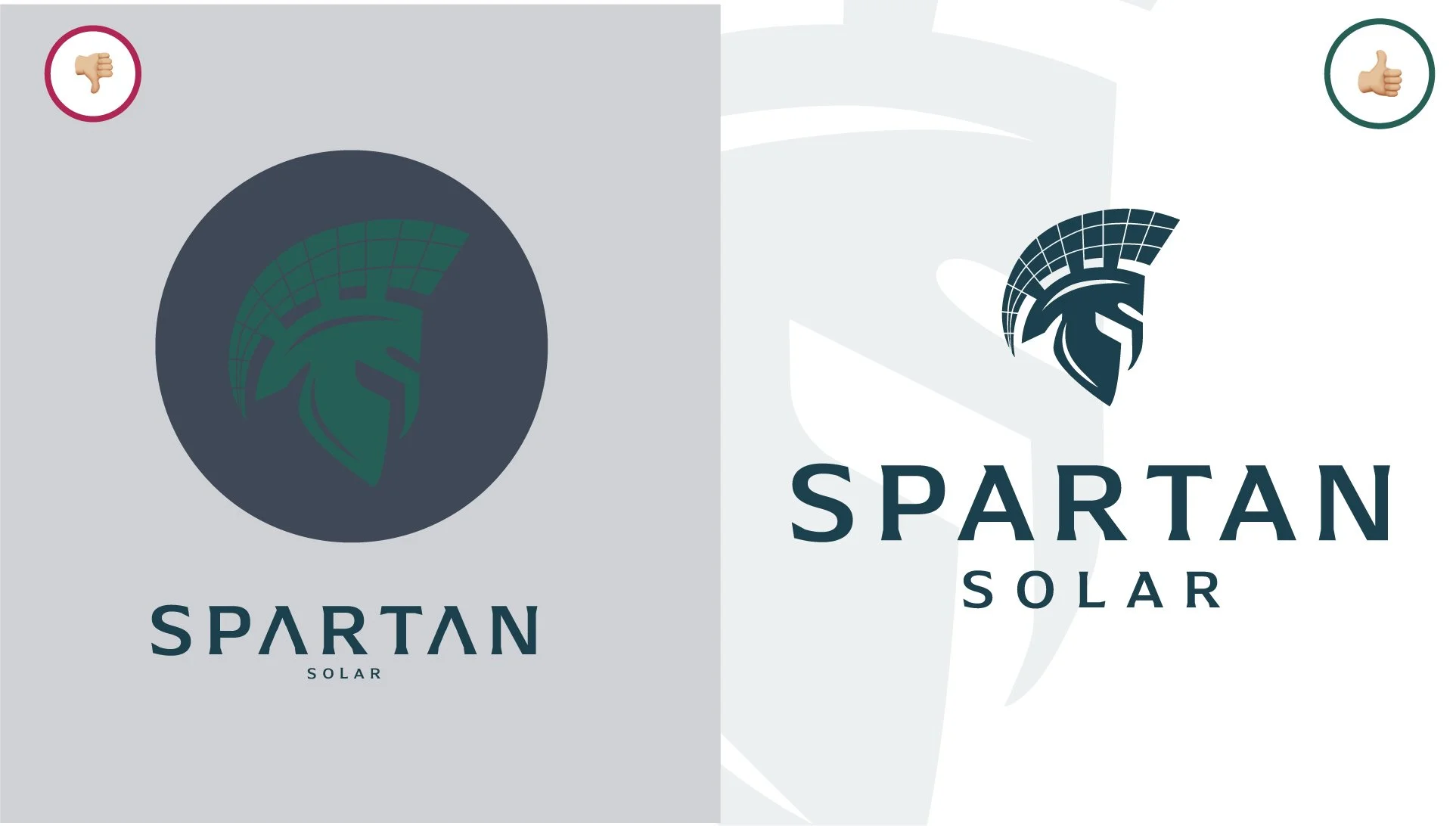
Logo Design: Non-Compliant vs. Compliant
My Path To Accessibility In Branding
I started out like most designers do. I went to design school, earned my BS in graphic design and branding, and learned all the core skills that shape our industry. Typography, layout, grids, hierarchy, color theory, brand systems…you name it.
Early in my career, I worked at some of the biggest agencies and with some of the biggest brands. NASCAR. Budweiser. Disney. It was exciting, and I learned what it was like to collaborate with large teams, work alongside copywriters, and enjoy the freedom that comes with big budgets.
But later in my career, I shifted into smaller Sacramento agencies that focused on nonprofits, government, and public sector work. It was there that I realized something important: I loved the big names, but nothing compared to making a small nonprofit look as ‘sexy’ as Nike or Disney. These organizations were working to change lives, shift behaviors, and create positive impact. They deserved the same brand consistency and presence that the big players had, but they rarely had a team of experts backing them.
That realization stuck with me.
“...Nothing compared to making a small nonprofit look as sexy as Nike or Disney. [Small Organizations] deserved the same brand consistency and presence that the big players had.”
Learning Accessibility From The Ground Up
When I became a Creative Director at another smaller well-known Sacramento marketing and creative agency, I had to stretch myself in new ways. Suddenly I wasn’t just designing and dreaming. I was guiding rebrands through board approvals, managing complex projects, adapting government campaigns to follow regulations without looking bureaucratic, and building brand systems on nonprofit budgets.
That was also when I was pushed to expand my skillset in a big way. I became certified in human-centered design. Then I learned ADA remediation. Over time, I realized that I wasn’t just learning how to make websites compliant or remediate PDFs for screen readers. I was learning how to design accessibility into everything.
Because once you know the rules, you see them everywhere.
If you know that yellow text on a white background fails color contrast for websites, why would you ever design your main logo that way? If a symbol is impossible to describe in words, how is someone using a screen reader supposed to connect with the brand story?
Accessibility cannot be a retrofit. It has to be baked in.
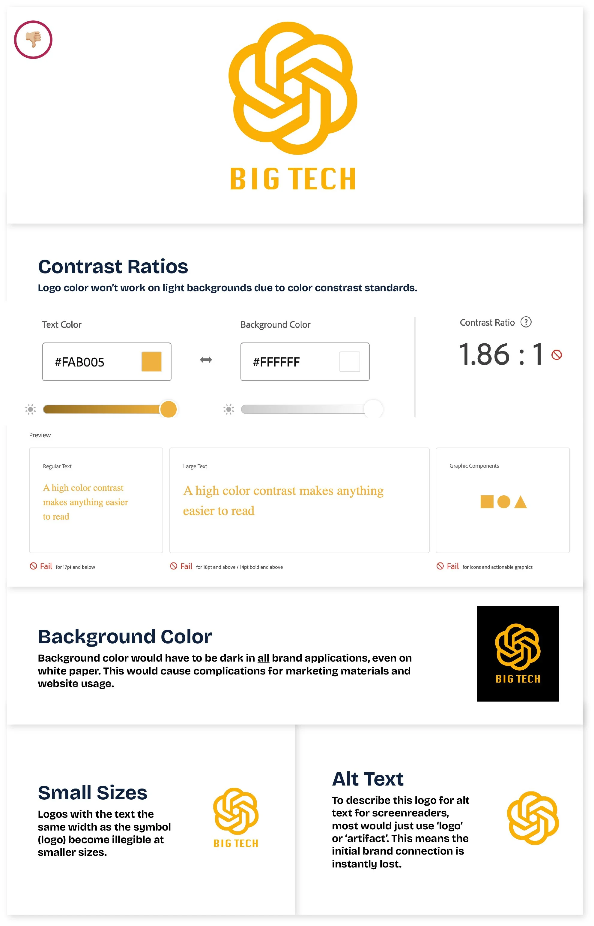
Why this logo misses the mark:
A yellow logo on a white background fails ADA color contrast standards. Without a strong storytelling symbol, the alt text would become an “artifact” and you loose an audience member upon brand impact. On top of that, when the text is the same width as the symbol, it becomes unreadable at smaller sizes (like in a website navigation bar, on a pen, or on letterhead).
What ADA Compliance Means For Branding
When we design a brand identity at Unmuted, accessibility is part of the foundation. That means:
Logos built for clarity and contrast. Designed to work at every size, with symbols that can be described clearly and connected back to the name.
Color palettes that are tested. Primary, secondary, and tertiary colors that work as backgrounds and foregrounds, with documented contrast codes in the brand guide.
Typography that works for real people. Text that is legible, readable, and accessible without losing style (yes, that means even fancy word marks).
Brand guides that include accessibility standards. Not just pretty hex codes, but rules for how to use them in a way that keeps the brand consistent and accessible.
This is the part that makes us different. We don’t just make brands that look good. We make brands that work for everyone.
Accessibility Does NOT Mean Boring
I have seen too many designers strip away personality in the name of accessibility. That is not what this work is about. Accessible brands can be bold, vibrant, stylish, and unique. The difference is they are also legible, inclusive, and built to last.
When I shared my reflections on the 2021 Disability Pride Flag redesign, this post went viral. The conversations that came out of it reminded me that small design choices matter, and that people want to feel included, not left out. That is exactly what accessible branding achieves.
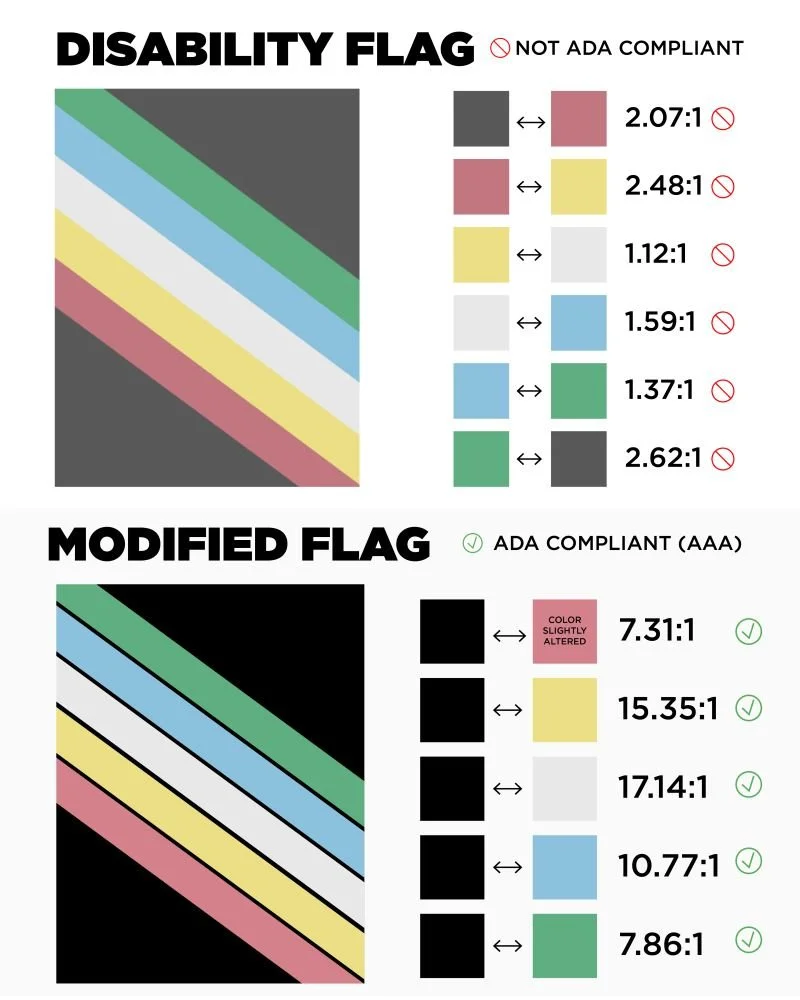
Modified Concept of the Disability Pride Flag
This version was created with low-vision accessibility in mind, but it also sparked important conversations. The high-contrast lines between muted tones raised concerns for people who experience migraines, seizures, and other sensory disabilities.
Disability is not one size fits all. Hearing both perspectives was eye-opening, and it reminded me that accessibility is always nuanced. Since then, we’ve worked hard to integrate harm-reduction techniques into our design process (alongside ADA compliance and WCAG standards) so our work supports as many communities as possible.
Is your brand accessible?
Brand Wellness Check: How Accessible is Your Brand?
Take a minute to run through these quick questions:
Logo Clarity
Can your logo be recognized instantly at both large and small sizes?
Does it hold up in black and white or grayscale?
Color Contrast
Do your brand colors meet WCAG contrast standards when paired together?
Can your palette work across light and dark backgrounds without losing legibility?
Typography
Is your main typeface easy to read in both digital and print formats?
Do you use more than two weights or styles in a way that confuses hierarchy?
Symbols & Story
Could someone describe your logo or symbol out loud, and would it make sense?
Does your brand story connect clearly with your visual identity?
Brand Guidelines
Do your brand guides include accessibility notes on color, contrast, and typography?
Or do they only cover logos, fonts, and hex codes?
If you answered “I’m not sure” or “probably not” to more than a couple of these, it might be time for a closer look at your brand’s accessibility.
We call it a Brand Wellness Check, and it is one of the first steps we use at Unmuted to strengthen brands from the inside out.
Ready to find out how your brand measures up? Reach out to us and let’s take a look together.