

THE JACQUELYN
Bringing a multi-sensory brand to life from scratch
Where it all started
A new multi-use lounge needed a brand identity that would unify its gallery, florist, wine parlor, and artist program under a clear and compelling system and brand.
Creating a flexible brand, marketing materials, and website was built around visual storytelling that helped secure pre-opening memberships and event bookings, and attracted early engagement from more than 5,000 community members post-launch.
Brand Identity & Logo Design solely designed by Noël Michienzi during employment at Uptown Studios.
Turning Vision Into Visibility
The strategy was to design a brand system that would engage the creative community and grow alongside its expanding collection of experiences. Inspired by a camera’s viewfinder and photography, the use of L-brackets became a versatile visual device that shows framing, storytelling, and movement. By using this visual system, each child and sub-brand stood on its own while remaining clearly connected to the parent identity.

Creative Direction
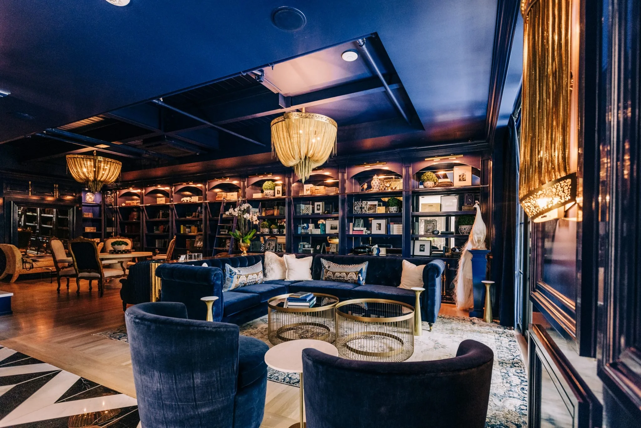
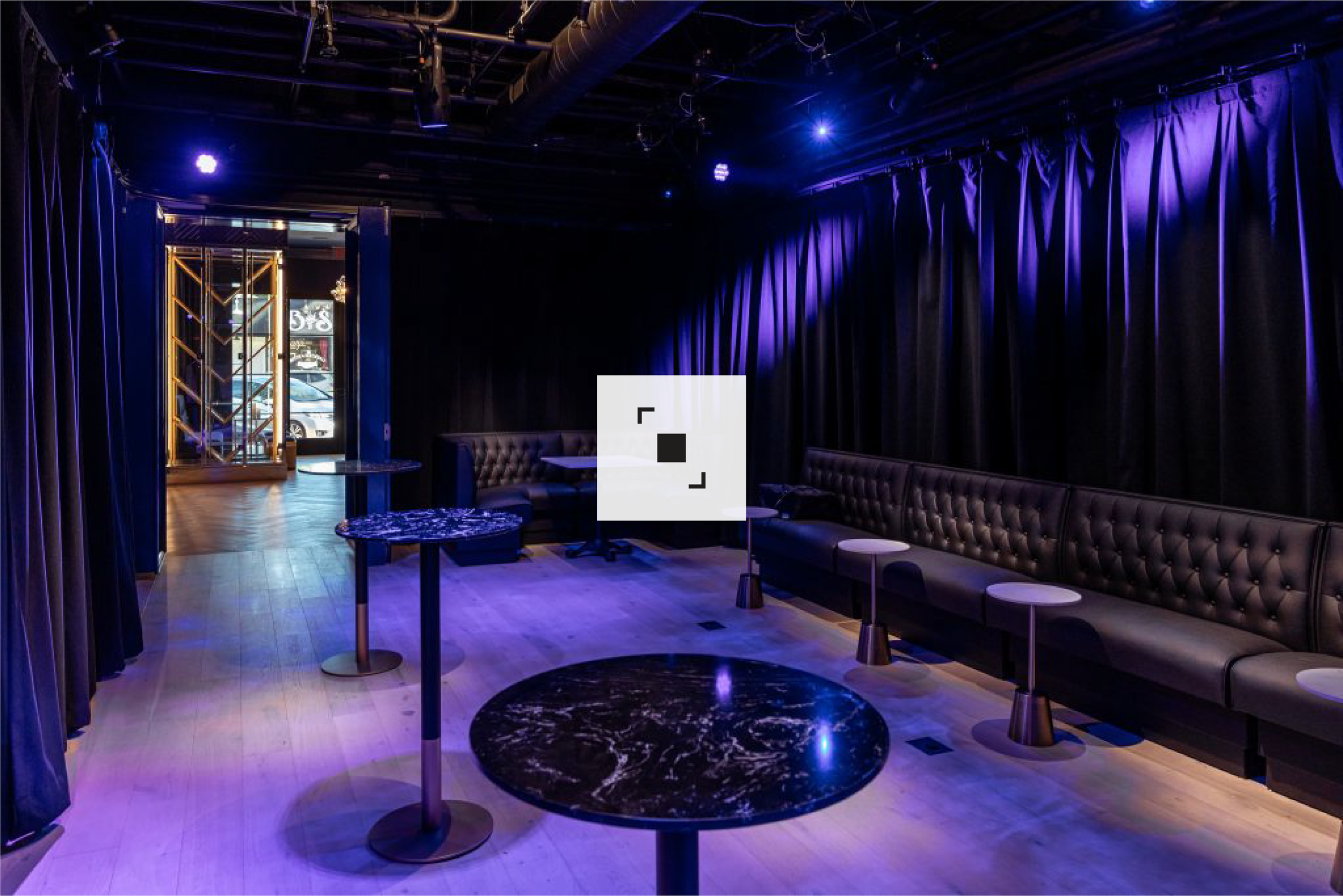
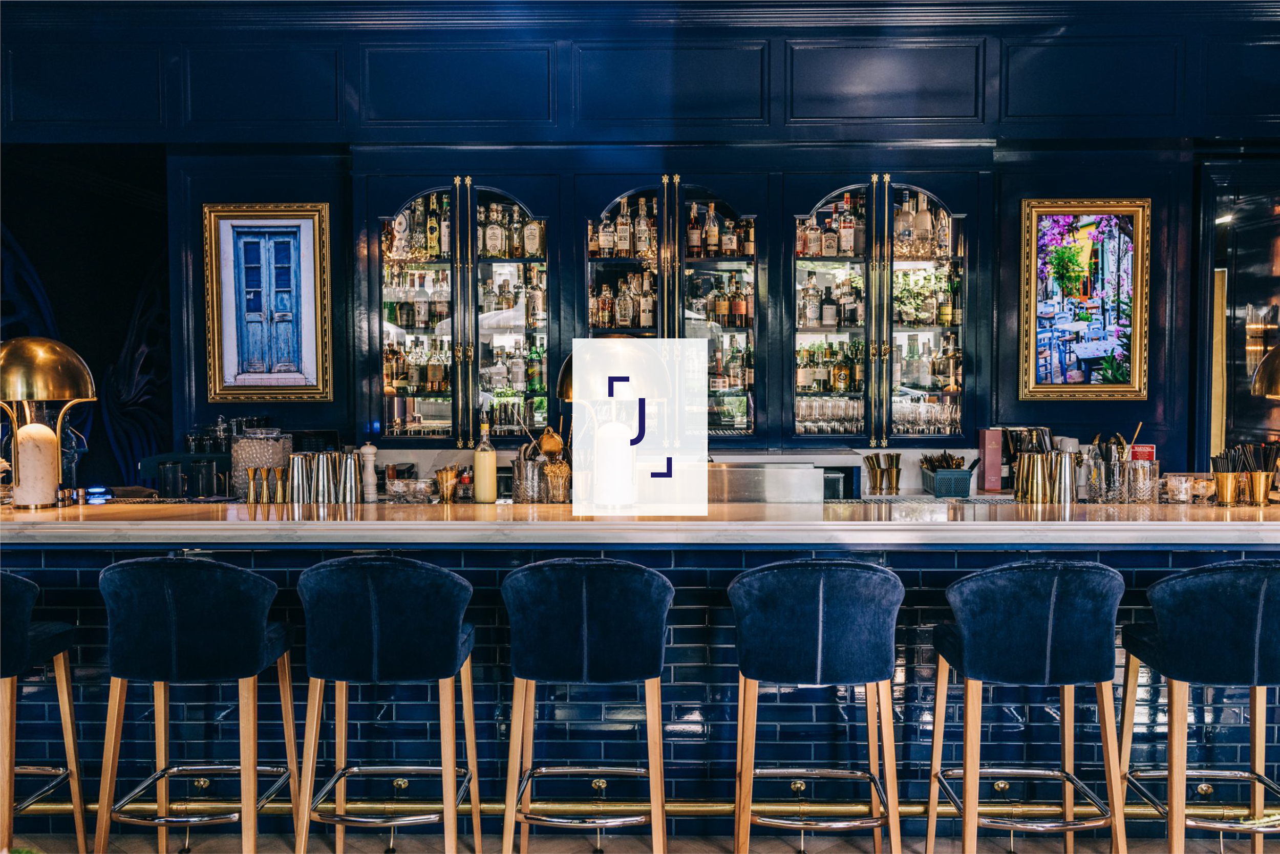
Creative direction extended beyond branding into environmental design, directing the building’s identity and the interior experience. Each room was given its own theme, mood, and visual language while remaining connected to the core brand. From curated textures and color palettes to signage and spatial flow, every detail was considered. Together, these elements created a layered, immersive experience that brings Jacquelyn to life.

Identity Development
The brand identity focused on a color system that helped to distinguish internal and external concepts, while a consistent typographic foundation ensured cohesion. The website was crafted as a digital extension of the physical space, offering users the same feeling of intentional discovery. The result is a brand that feels curated and unified, yet open to evolution.

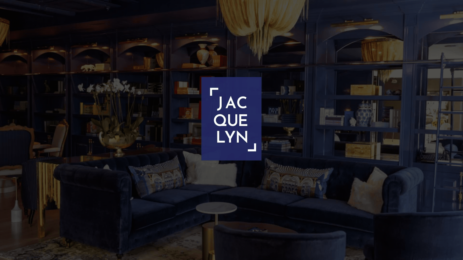
Parent Logo
The parent logo uses subtle L-brackets to frame the wordmark, evoking photography and moments in time. It anchors the entire brand system with flexibility and clarity.
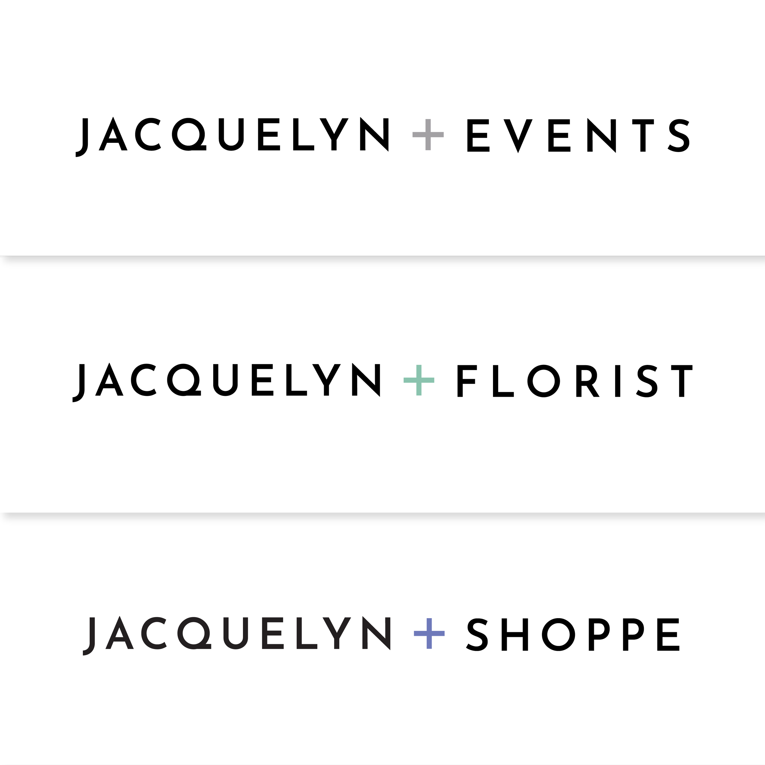
Child Logos
The child logos incorporate L-brackets forming an “+” to symbolize an addition to the building, and represents the brands inside of the Jacquelyn.
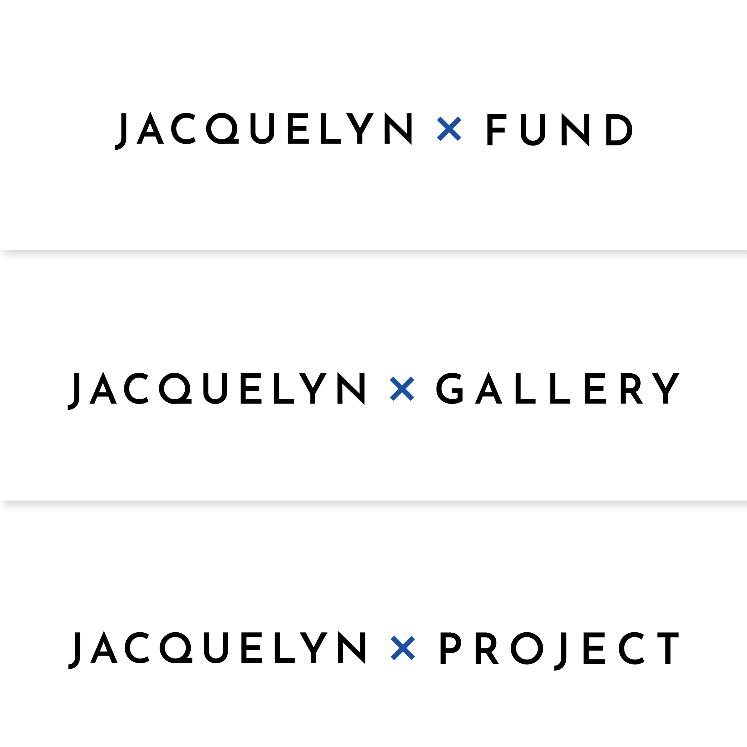
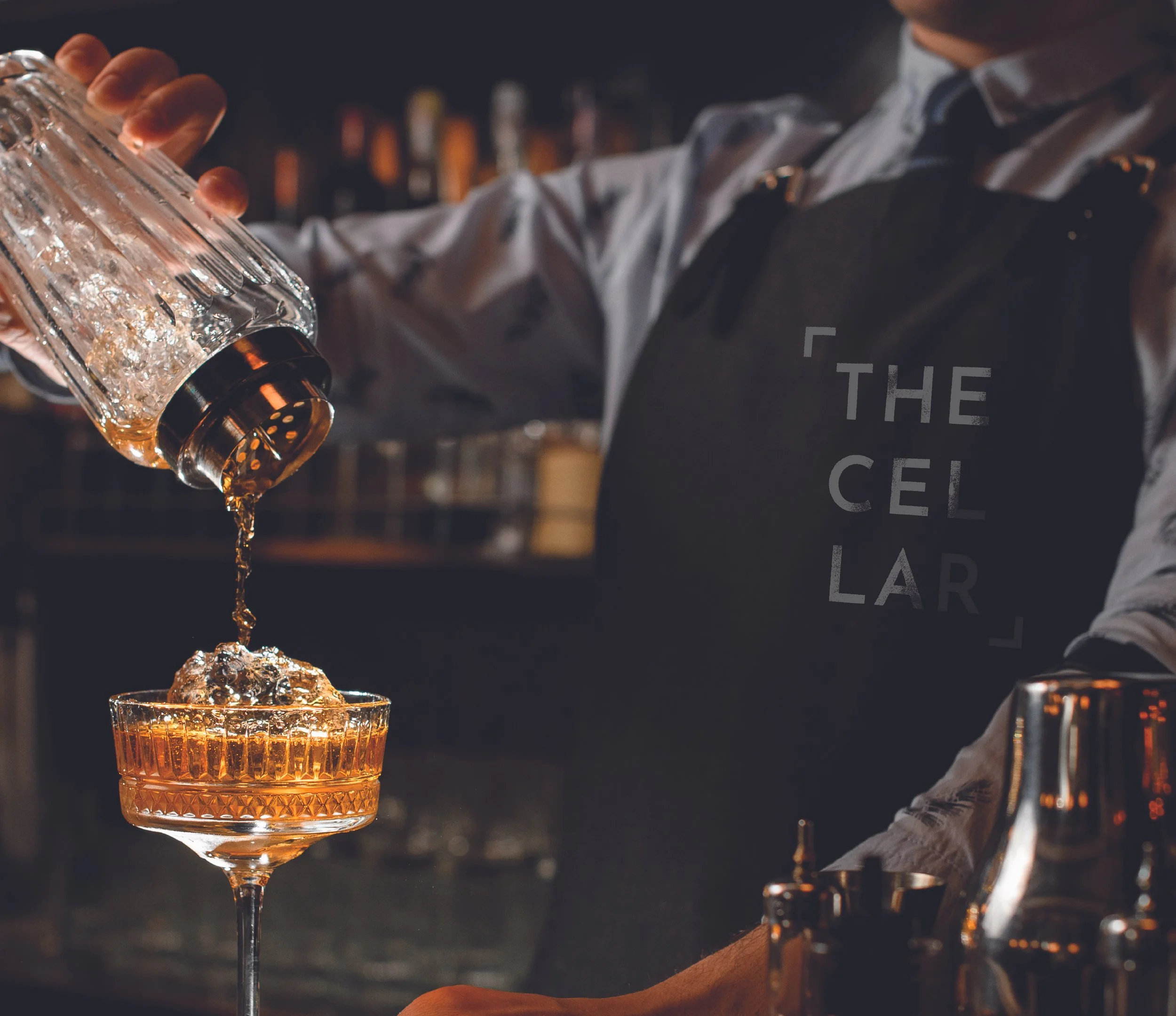
Partner Logos
Sub-logos incorporate L-brackets forming an “x” to symbolize collaboration and community between brands outside of the Jacquelyn. The idea was that Jacquelyn was multiplying partnerships in the community.
Outcomes
Identity Established Pre-launch
Developed a layered visual identity system that established Jacquelyn as a destination brand before the building even opened.
Early Engagement Campaigns
Drove early engagement through cohesive digital campaigns, visual storytelling, and branded video, positioning Jacquelyn as a hub for Sacramento’s creative community.
Created Impact
Contributed to a marketing rollout that captured consumers and diverse artists nationwide and created community buzz leading to successful pre-launch event bookings.