SETA
Unifying 20+ programs under one flexible, public-facing brand
Project Overview
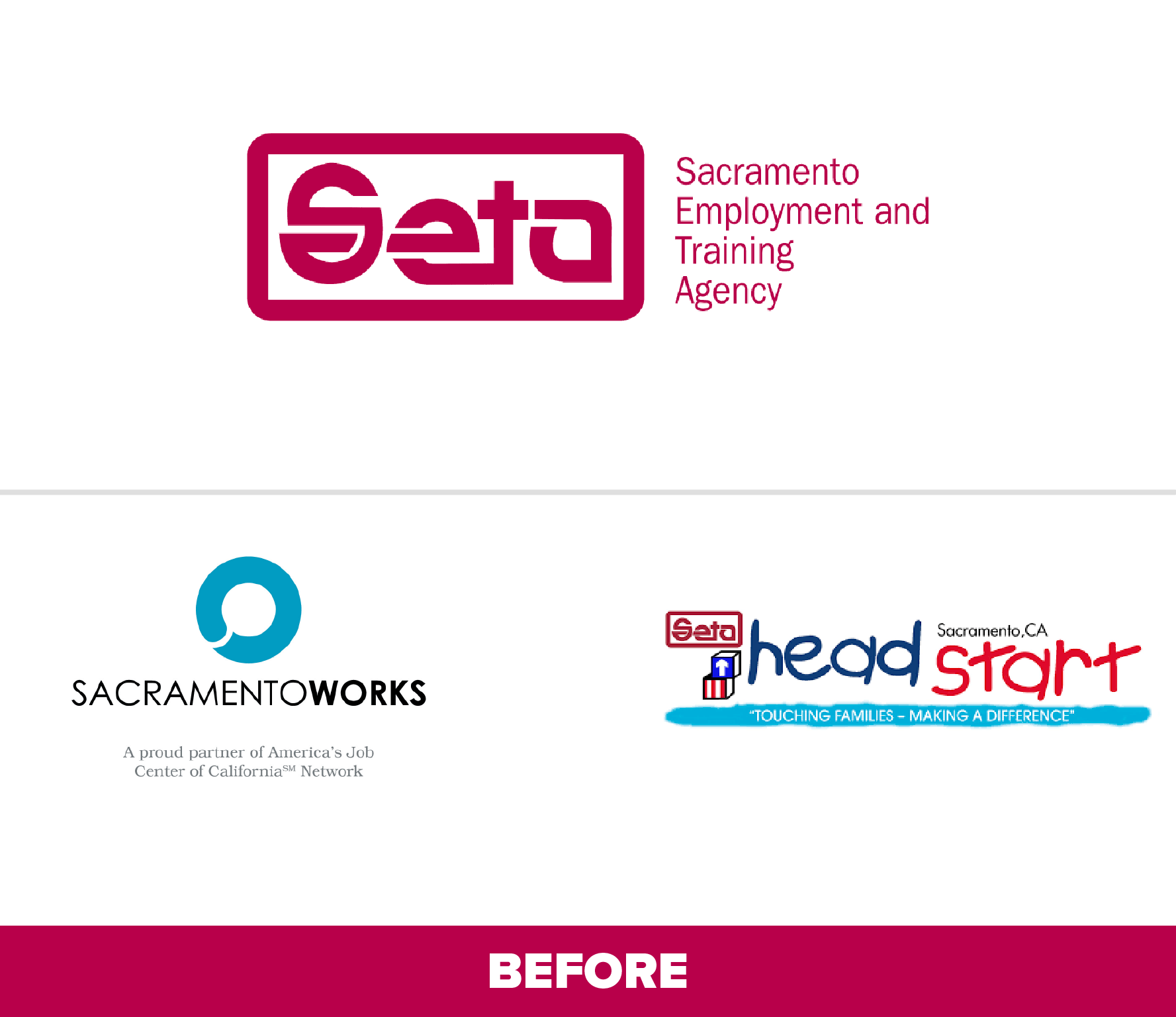
SETA needed a cohesive, adaptable identity that could unify its broad range of programs while honoring the agency’s long-standing legacy in workforce and community development. In partnership with Uptown Studios, the goal was to create a modern, flexible system that could serve everything from early childhood education to employment services, while still maintaining the credibility and trust the agency has built over decades of service. By aligning its visual identity with its mission, SETA is now better positioned to connect with diverse audiences, strengthen community recognition, and support its evolving programs well into the future.
Brand Identity, Parent, Child, and Sub Logo Design solely designed by Noël Michienzi during employment at Uptown Studios.

Strategy & Approach
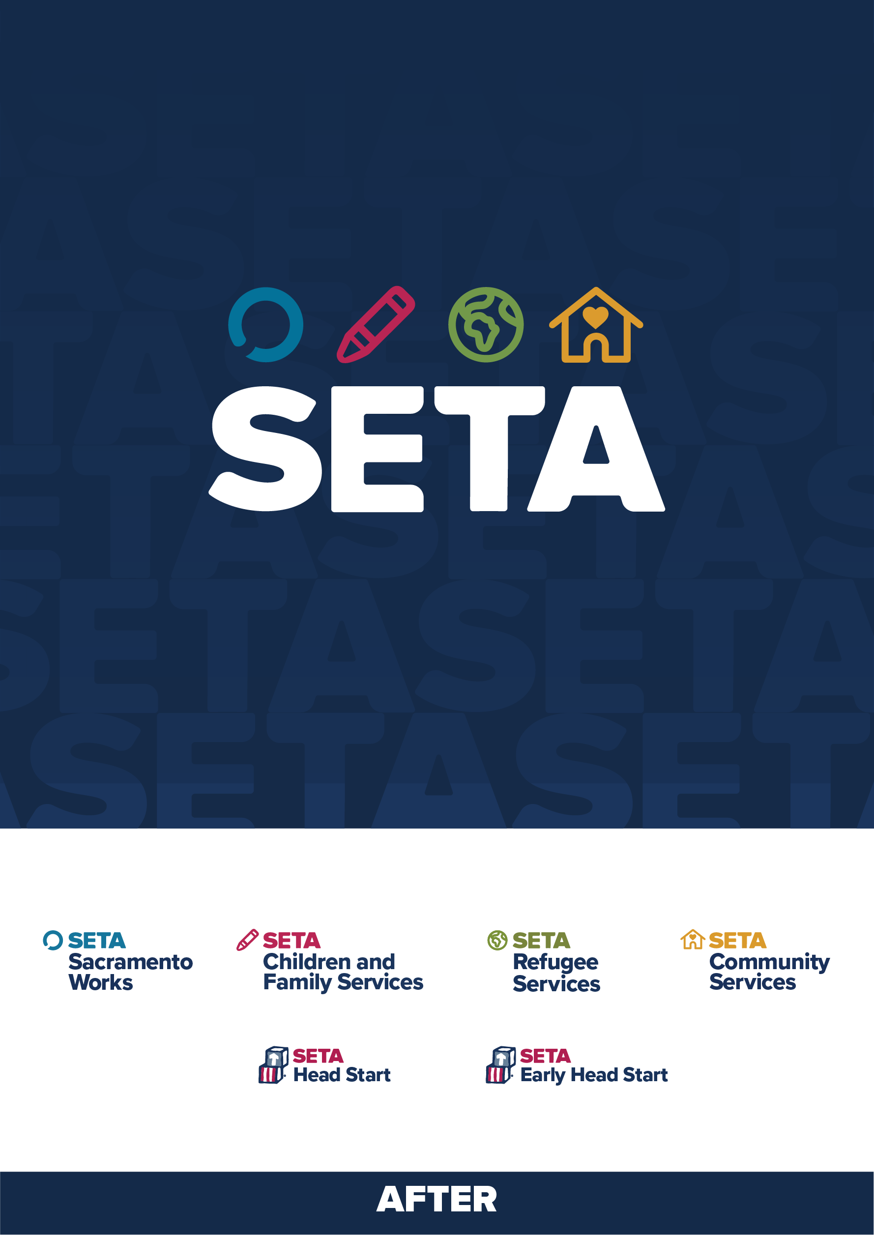
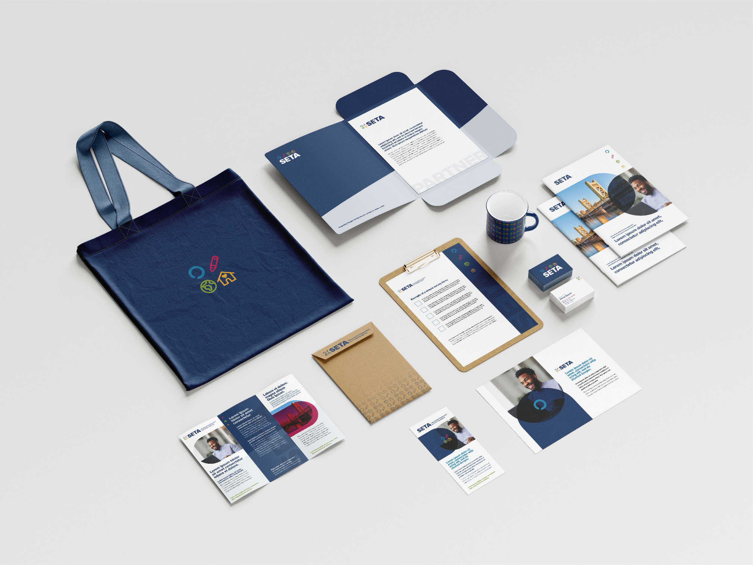
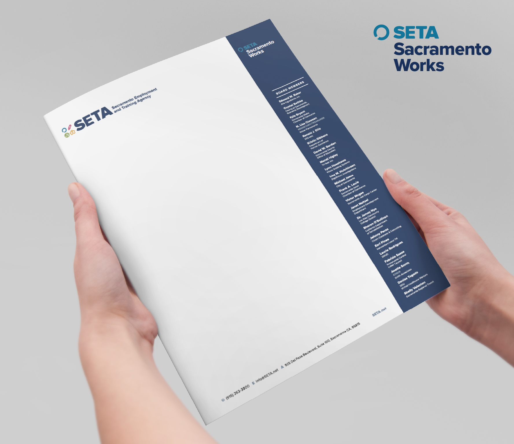
The rebrand was designed to simplify and unify. A structured brand architecture was built to house all divisions under a consistent visual and verbal system. The strategy focused on accessibility, community trust, and scalability across hundreds of platforms. Every asset supported the goal of brand clarity while being flexible enough to evolve with the agency’s ongoing work and future programming.
Creative direction focused on utility and recognition; forming a system that was navigable and expressive.
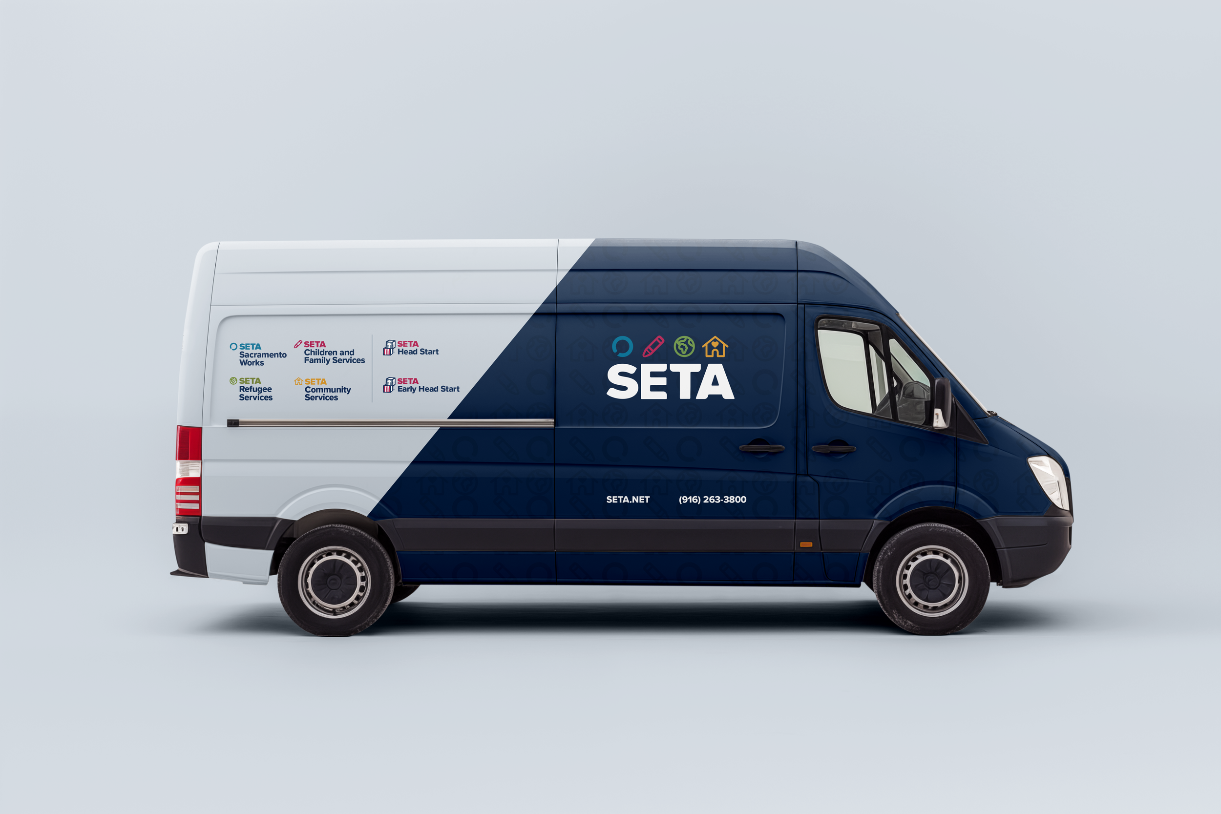
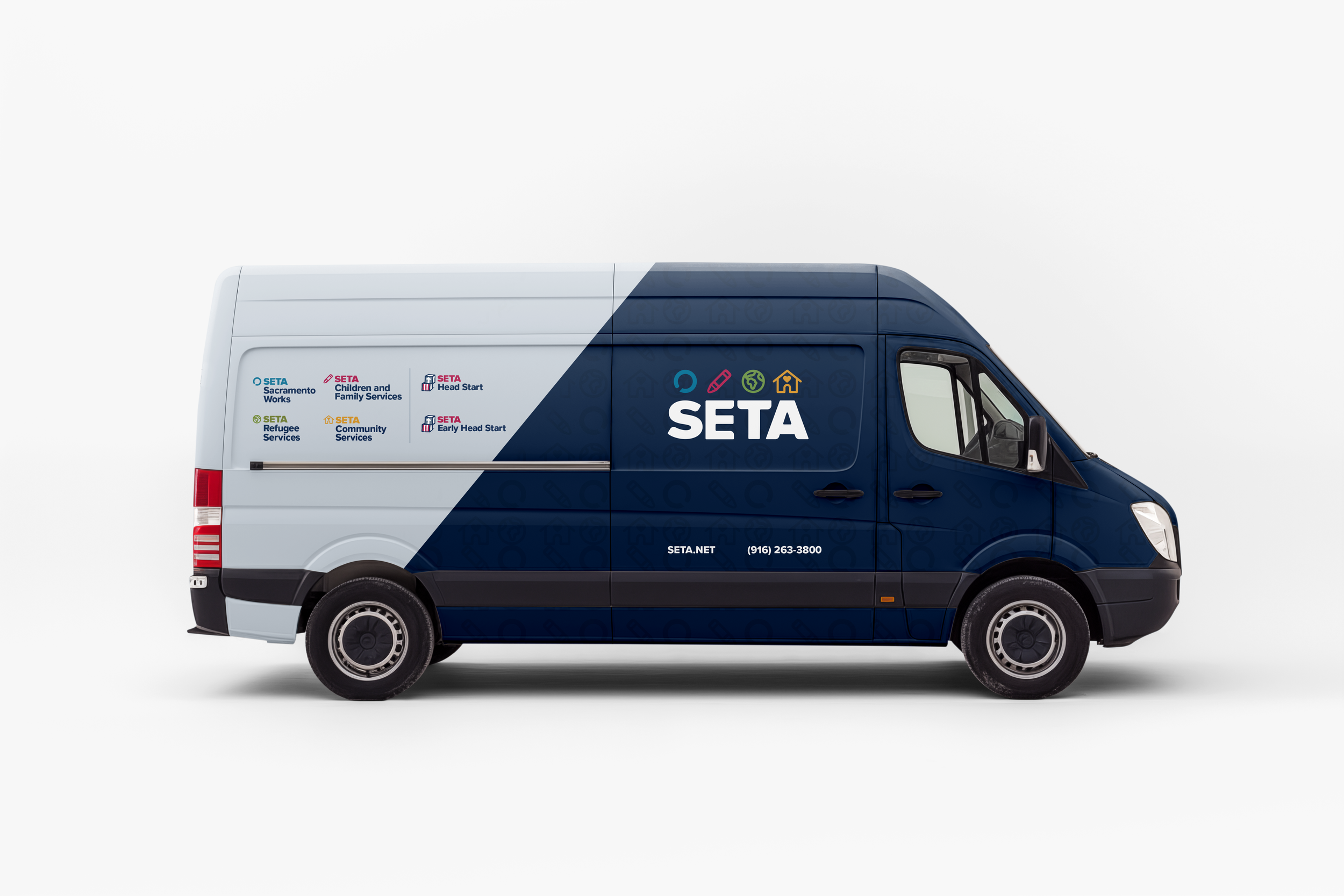
Each program received its own mark and color, forming a system that helped to organize all of the child and sub logos. Iconography was built to be universally understood across language and literacy levels. We created custom vinyl wraps, presentation materials, and brand rollout tools. Videos and website components were developed to match this clear, supportive tone, making the brand not just visible, but approachable and dependable.